Work Record Shoot 2
Plans for Shoot
My plans for this shoot is to use some of the landscapes I took when visiting a town in Iceland and to edit them similar to Stefen Lenz images.
Research Influence
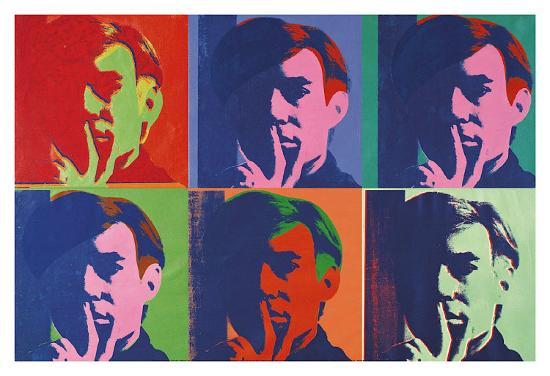
Stefen Lenz
Stefan Lenz, born in Germany and raised in the southeast of Austria, discovered his love for travelling in 2010. In the following eight years he visited a total of 52 countries on four continents. In 2016 he started travelling alone and focused more and more on his second passion, which is photography. Meanwhile his photos regularly inspire several thousand followers on Instagram
Image Bank
Contact Sheets
Best Images
Images that need Improvement
I have selected the image above because of the poor quality of the image. The camera was zoomed in too much (36x) and because of this the quality of the image has been lost.
I have selected this image because of how it was taken. The angel of the image is not landscape or portrait and in my opinion it doesn't look very professional for landscape images.
I have selected this image because the camera isn't in focus. It also isn't very straight, to improve this I could've used a tripod.
AO1
For this shoot I had to experiment and discover different tools in Photoshop. With further research into crystal ball photographers, I found that majority is landscape photography, however I found some crystal balls with flowers in them. If I was able to shoot again I would take photos of flowers and edit them into crystal balls.
AO2
I am inspired by Stefen Lenz's crystal ball photography and wished I could've taken some of my own photos, however instead I am going to edit my images as if there is a crystal ball. If I was to shoot again I would invest in a crystal ball to get a better effect.
Below shows the process of how I edited my images to get a crystal ball effect.
1.

To start off my crystal ball edit, I opened another tab with the image I am using so I can make the main focus of the image into a circle. To do this I used the elliptical selection tool to circle the area of the photo I want to be the crystal ball, I then added a layer mask to this and this automatically cut out the other parts of the image that wasn't circled ( these are both circled in the image above, along with the result of these steps). I then moved my new image into my first tab where the same image is, but will be used as a background.
2.

The next thing I did was change the settings on the background image, just to define the edges of the cropped image ( the crystal ball ). I did this by giving the image a higher saturation and then adjusting using a curves layer as originally the exposure was a bit too bright. I then adjusted the cropped image by turning it upside down, the same effect the crystal ball has when holding it up to an object of focus. I did this and noticed that in the crystal ball there is a slight bend in the image that is shown, to try and achieve this affect, I adjusted the image further by using the warp option. This allowed me to stretch and bend the image to my liking. I had to duplicate the image to do this as I needed to keep the circular shape of the crystal ball. The image above is a screen capture of the warp option in action.
3.

After playing around with the warp image, I noticed that the 'crystal ball' does not look like a 3D ball. To develop on this I took a paint brush tool and selected a slightly darker blue than the one in the cropped image, and then lowered the opacity of the brush so that the strokes aren't too harsh ( these are both circled in the image above). I then start painting and adding tone and depth to the crystal ball to try to make it look more 3D. I then took the same brush but with the colour white to add the highlights of the crystal ball. Various colours and a changing opacity for the brush was used to get a result I was happy with. The image above shows the beginning of the shading.
After some time adjusting and tweaking the image, I soon got a result I was satisfied with. With more time I believe I could've made the crystal ball look glossier and more crystal ball like.

While I was editing the crystal ball images I got an idea to experiment with placing circles of the image in an arrangement. For this image above, getting the circles was the same process as the previous edits. I duplicated the circles and placed them in an arrangement. To make the circles stand out I used a layer mask on the saturation layer to make the background unsaturated, this is circled in the screen capture displayed below. I got various ideas while playing around with these circles, they are displayed in my final images.

AO3
My intentions for this shoot was to capture landscapes that I can edit to create a crystal ball effect. I have learned new techniques in Photoshop during this shoot an d I believe with the time I was given, I have successfully displayed my intentions. With further research I may have been able to make the 'crystal ball' look glossier and more realistic, however my crystal ball does have depth in it and it doesn't look 2D. I also think that some of my methods had a quicker short cut, and by finding these out I could've saved time to then focus more on the shading and highlighting of the crystal ball to make it neater and more effective.With the other edits I did, I loved how effective the simplicity of it was. Some things I would change if I was to re shoot, would be to use a tripod and to get a wider variety of images to work from. When photographing the waterfall, my lens got water droplets on them which made it very hard to keep the lens clear.
AO4