Work Record Shoot 1
Plans for Shoot
For my first exam shoot I have taken images of a finished make up look I created. My idea was to create finished images influenced by Andy Warhol's pop art. To do this I have photographed the same make up look but with different colours each time. To experiment with my images I want to edit some individual images to see how I can add a more refined finish to my images or a surreal twist to them.
Research Influence
Christel Bangsgaard


Andy Warhol
Andy Warhol, born August 6, 1928 – February 22, 1987, was an American artist, director and producer who was a leading figure in the visual art movement known as pop art. His works explore the relationship between artistic expression, celebrity culture, and advertising that flourished by the 1960's, and span a variety of media, including painting, silk screening, photography, film, and sculpture. I have decided to research into this artist because his presentation of his art has influenced me to create my own version of his pop art.

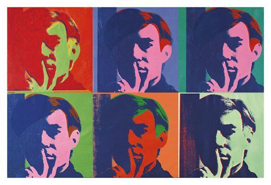
Andy Warhol, born August 6, 1928 – February 22, 1987, was an American artist, director and producer who was a leading figure in the visual art movement known as pop art. His works explore the relationship between artistic expression, celebrity culture, and advertising that flourished by the 1960's, and span a variety of media, including painting, silk screening, photography, film, and sculpture. I have decided to research into this artist because his presentation of his art has influenced me to create my own version of his pop art.
Image Bank

The image above is a pop art style of a drag queen called Trixie Matel. I love this image as most drag queens see drag as an art and can be really creative with their makeup. Their bold make up can be bright and vibrant and something unique to them, which is what I am aiming for with my makeup look.

This make up look incorporates polka dots with a chosen colour palette. I love how sharp and finished the make up is, topped with lashes and coloured contact lenses.
Contact Sheets


Best Images


Images that need Improvement


Throughout the shoot many images became blurry simply because of the close proximity of the camera; Because of this the camera wasn't in focus. As well as this, I used a slow shutter speed therefore the model or camera moving while the photo is being taken could also be a result in the images being blurry. Three examples of these images are presented above. To prevent these issues occurring, I should have used a tri-pod as extra precaution to keep my camera still. I also should've used the macro setting on my camera to help the camera with the close proximity and focus.


My method for taken these images lead to some shadows appearing in my images. I've used the flash in this shoot to capture as much detail as I can, and because of the close proximity the barrel of the camera sometimes created a shadow on the face; Because of this the images are too bright or blurry. Four examples of this are presented above. To prevent this from happening I zoomed into the models face rather than moving the camera closer to the face.
AO1
For this shoot I have done research for Photoshop tools to discover ways to create a Andy Warhol effect on my images. I have looked at tutorials which all show different ways to create different effects which all relate to Andy Warhol. This has helped me a lot as I have discovered new methods and settings which could help me in future shoots.AO2
The camera settings I used for this shoot was a shutter speed of 1/60 and an aperture of F5.6. I kept this consistent as it kept my images consistent and was much easier to keep the same, especially when you're using the flash which I had to keep in mind when setting the aperture.
1
 2
2

3

4
 5
5The images above show the editing process for my first final edit. The first image is the unedited image that I am working on, the second shows my first lot of editing I did. You can see how the skin looks a lot clearer, and the makeup and eyebrows look a lot neater and the contact lenses in the eye is a lot less obvious. I achieved this by using the blemish tool. Because I wanted to have bright, vibrant colours I then made the saturation a lot higher, however this also caused the skin to look a lot more red and saturated this is shown in the second image. To fix this issue but still keep the orange makeup bright and saturated, I put a layer mask over it and then used the paint brush tool to remove any of the harsh unwanted colour. The orange came out a lot brighter than the other colours, so I used a layer of Curves to adjust this and make it better suited to the other colours. With more tweaking to the settings I got a final result I was happy with, which is shown in the last image. A screen capture of the layers and settings is shown next to the last image. I repeated all these steps for each individual photo that I'll be using for the final edit, some more examples of this is shown below. Once all the images were completed to my satisfaction, I then placed them together to created a 2x2 collage of my images to create a final edit.


Using the influence of Andy Warhol, I further developed my images by making the colours more suited to his pop art style. The editing process of this was similar to that of the edits above, however a different layer was added after all the blemishes, cropping and refining was completed. Rather than giving them a high saturation I added a Gradient Map layer onto the images. This allowed me to add colour to my images without using just a block colour, but refined the shadows in the image by selecting a darker colour that blends with your main colour you select. A screen capture of this and an example of what it looks like is shown below.


Once I edited all my images to how I wanted them, I then transformed them all onto one page and adjusted them all to fit in an Andy Warhol collage. I believe this edit is a lot better than my first as it looks a lot better and links more to Andy Warhol. I believe if a viewer looked at this final edit, they would know it's linked to pop art. Shown below is all the layers of the final edit.

AO3
My intentions for this shoot was to create a finished image related to Andy Warhol that incorporates circles into the image. I loved experimenting with different make up looks which are shown in previous shoots in component one. I love this make up idea as it incorporates circles in a simple way, this made it easier to copy when using other colours. I believe I was also very successful in capturing detail in the make up and the iris of the eye. The blue eye stands out great against the colours I've used, in particular the orange and green colours, and vice versa. But because of how simple it is, it could become too repetitive when I present my final images, however I believe if I edit my images successfully I will eliminate this factor. I also found trouble working with the yellow shade because it is not as bright and vibrant as all the other colours I have used.
If I were able to do another shoot for this exam I would use more of the face, rather than just photographing the eye. If i had a model to work on and photograph, I believe this shoot could've had a better variety of images, rather than just the eye.
AO4
Displayed below are my final images, refined to my satisfaction in the time given.


No comments:
Post a Comment